Welcome to the AES Blog
How to run your MEL program digitally using free tools

I was recently talking with a non-profit client of ours at the end of one of our regular meetings. We'd strayed from our automated maturity assessment project to talk about some of the other projects they were working on. They walked me through one of their social impact programs and the processes involved in gathering, analysing, and improving data. One thing immediately stood out to me: the processes were very manual, time consuming, and generally diverted their attention away from the more important work of understanding what the data was telling them and how they could improve.
It made me wonder if there wasn't a more automated and digital way to do this work. While doing some basic research, I discovered a number of platforms that usually came with a very high price tag, far out of my client's reach. Our organisation's goal is to use our natural curiosity and focus on effectively using technology to simplify and solve complex problems in order to assist organisations in reaching their full potential. So, I collaborated with leading social innovation guru, Tracy Collier to learn about the typical steps in a Monitoring, Evaluation, and Learning (MEL) Program and to identify some free tools that can be used at each stage.
A simplified MEL process
The diagram below depicts some steps in a simplified MEL process; we'll go over each section and provide a free tool or two for each step. We are not affiliated with any of the platforms mentioned below and receive no compensation if you use them.
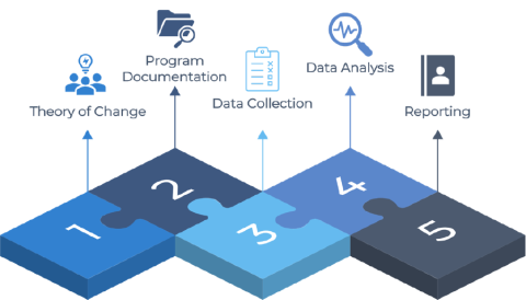
Step 1. Theory of change
It can be difficult to visualize and document your theory of change, mapping out the various steps involved and identifying the relationship between the inputs and outcomes.
Free tool – Dylomo
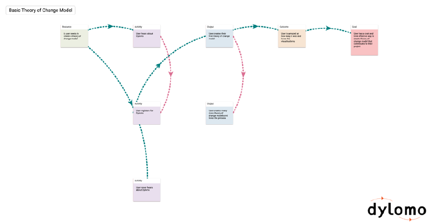
Dylomo is a tool designed specifically for creating logic models, with a user-friendly interface that allows you to do everything by clicking, typing, and dragging. The tool is completely free to use; all you have to do is register. The logic model can then be saved as an image or displayed on the screen. The only limitation appears to be multiple users collaborating on the logic model at the same time.
Step 2. Project documentation
With your theory of change and metrics in place, you'll need a place to store key project documents, collaborate and share with others, and centralise your project information.
Free tool – Notion
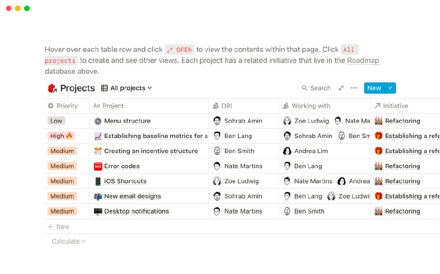
Notion is a one-stop shop for tasks, notes, documentation, links, calendars, and group collaboration. You can create pages that your team can view and edit, and use it as your central repository for all MEL Program information. Notion has a very generous free plan that allows you to create as many pages as you want with as much content as you want and have up to 5 guests view the information. Google Docs is another free tool with unlimited collaboration, but it is not as sophisticated in terms of task tracking or organising information.
Step 3. Data collection
Data collection from stakeholders, external sources, or internal systems is an essential part of the evaluation process. In an ideal world, the information you gather would be structured and automatically stored in a central location.
Free tools - Google Forms and Google Sheets
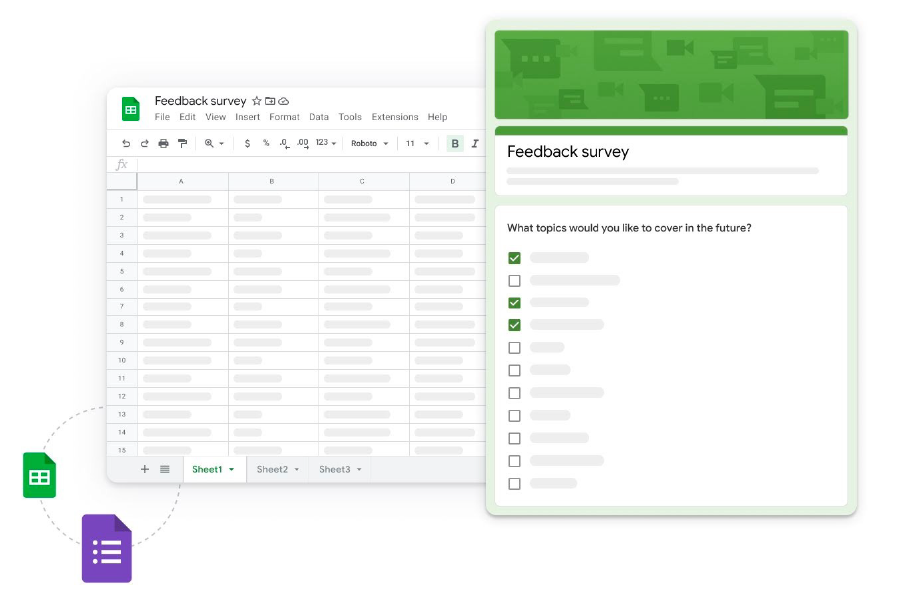
Google Forms is a free tool for collecting quantitative data; with a simple form builder interface, you can have a survey up and running in minutes. The best feature of Google forms is the ability to directly link the responses to a Google Sheet (a free online spreadsheet), ensuring that all of your data is structured based on the responses but also saved centrally in an accessible database. You can add multiple sheets to Google Sheets and paste in other external data that was not collected from Google Forms, ensuring that all data is stored centrally.
Step 4. Data analysis
After you've collected and saved all of your data, the next step is to analyze it to see what it's telling you about your project. Your project may include both qualitative and quantitative data; we have free tools for both.
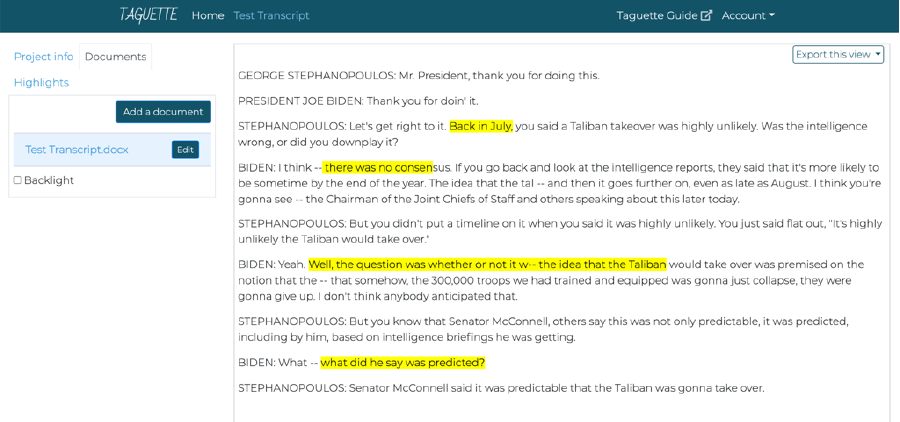
Free tool for qualitative data - Taguette
Taguette is a useful tool that lets you upload a variety of document types (.pdf,.docx,.txt,.odt,.md, or.html), create tags, highlight and mark text with those tags, and then export summary or detailed counts of your tags and highlights. There is a lot of flexibility in terms of exporting as a word document, excel file, or PDF. If you use the online version, you can also collaborate with others (alternatively there is an app you download for Windows or Mac). Once you have your summary data, I recommend copying it into your Google Sheet to keep everything in one place.
Looker Studio, formerly known as Google Data Studio, is a free data visualization and analysis tool. It has a built-in Google Sheets connector, so you can easily import your data from Google Sheets and start creating tables and visualisations to help with your data analysis - data from your Google Sheets is automatically imported every 15 minutes, so once you've set it up, any new data added to your Google Sheet will appear in the data analysis report you create.
Step 5. Reporting
Free tools - Flourish Studio and HeyZine
Flourish Studio is a fun data visualization tool that allows you to create data graphics and animated data stories. It's fairly simple to use; simply upload your data, select a visualisation style, and then make some changes. Their free plan comes with a plethora of templates, unlimited projects, and publishing options (that include attribution to Flourish Studio.)
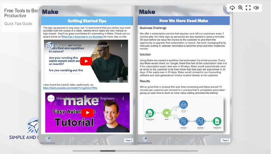
HeyZine is a simple tool for creating interactive PDF ebooks, so once you've finished your Project Report and are ready to share it with stakeholders, upload it to HeyZine and create an interactive PDF that allows you to embed clickable videos, links, and images and share the link. This is an excellent method for bringing your static report to life for your stakeholders.
Data privacy and security
A quick note on data privacy and security with these tools: while they are well-designed and secure, there is always the risk (albeit a minor one) of your data being hacked. Simple security best practices, such as ensuring that only those who need access to data have access and that user credentials are protected, will generally help you avoid problems.
I'd also recommend that, whenever possible, no personally identifiable information or confidential information that can be linked to an individual or specific organisation be collected or stored. If you need to collect sensitive data like this, I recommend conducting your own research on these platforms before utilising them.
Conclusion
You can run your MEL program digitally for free while also taking advantage of some existing automations to connect your data collection, data storage, data analysis, and visualisation.
-----------------------------------
David Watters is the founder of Simple and Engaging, we believe that every organisation should have the opportunity to fulfil their potential, but they can't do this trying the same things over and over again. We take our natural curiosity and our focus on effectively using technology to simplify and solve complex problems to help organisations achieve their full potential and feel proud of the impact that they are having on the world. We providing a range of automated maturity assessment, data visualization and small business automation tools to help small businesses and non-profits do more with less.
David has extensive experience in utilising technology for strategy, operations, data analysis, sales and marketing to drive measurable value. With over a decade of experience, David has held senior roles at Valta Technology Group and Pearson Australia working across the globe leading complex and agile digital programs of work through a client-centric approach.

We acknowledge the Australian Aboriginal and Torres Strait Islander peoples of this nation. We acknowledge the Traditional Custodians of the lands in which we conduct our business. We pay our respects to ancestors and Elders, past and present. We are committed to honouring Australian Aboriginal and Torres Strait Islander peoples’ unique cultural and spiritual relationships to the land, waters and seas and their rich contribution to society.